aboutworkservices
say hey
Hand holding a smartphone displaying a knitting pattern for a colorful hood scarf on a fashion website.

Part creative space. Part e-com store.

Making it easier to match tenants

Lorem ipsum dolor sit amet, consectetur adipiscing elit. Suspendisse varius enim in eros elementum tristique.

Client

Full name

Date

March 2023

Role

Role name

Website

www.relume.io

Make Your Own

Made it easier for MYO to extend the product

Year

2022-2024

Timeline

12-24 months

Platform

Shopify, Webflow

Industry

DIY Products

Tools
figma app icon

Figma

Webflow app icon

Webflow

Team

2 Designers, 1 PM, 3 Engineers

01 Situation

A strong base, unclear next step

When I joined MYO, the business was already working. The Shopify store was growing, DIY kits were selling well, and their content was driving steady traffic. What wasn’t clear was what MYO should become next, and how digital products could support that shift without breaking what already worked.

Smartphone displaying an online shopping page for a hood scarf named 'Dhalia' with options to select size, quantity, and color.
Currently
E-Commerce
Quick Product Checkout
Hand holding smartphone displaying MYO website with purple microfiber towel and color options.
Currently
E-commerce
Product Page Variants
02 What I stepped into

Effective, but narrow

At the time, MYO revolved around a few core pillars:

  • Selling physical DIY kits

  • Driving traffic through YouTube and social content

  • A traditional e-commerce funnel

There was growing interest in deeper engagement, learning, repeat use, and community, but no shared picture of how that should translate into product decisions. There was no shortage of ideas or plans for scaling e-commerce. The challenge was deciding which directions were actually worth building on.

03 Tensions

Growth without over-structuring

There were also practical constraints. Everything needed to work for a wide and varied audience, spanning multiple generations. That meant shipping incrementally: no big rewrite, no risky platform bets. A few key questions shaped the work:

Currently
Retention

How do customers come back after buying a DIY kit?

Currently
Content flow

How do we streamline the creation and distribution of instructions?

Currently
Structure

How much structure can we add without making crafting feel rigid?

Three mobile screens showing a Swedish app flow: account registration prompt, membership plan selection with monthly and yearly options and discount code entry, and a thank you confirmation screen.
Currently
Onboarding
Register New Account
Mobile interface of MYO app showing a welcome message, latest crochet instructions featuring a multi-colored scrunchie named 'Fanny', and category buttons for bags, home decor, kitchen, and accessories.
Currently
Onboarding
User Dashboard Instructions
04 Decisions I owned

Direction over features

My role was to help turn ambition into something buildable, and to set a direction the team could realistically execute on. I led design across two parallel tracks:

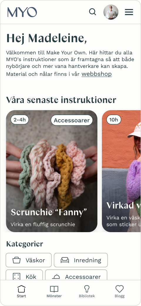
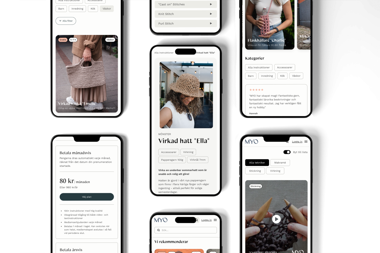
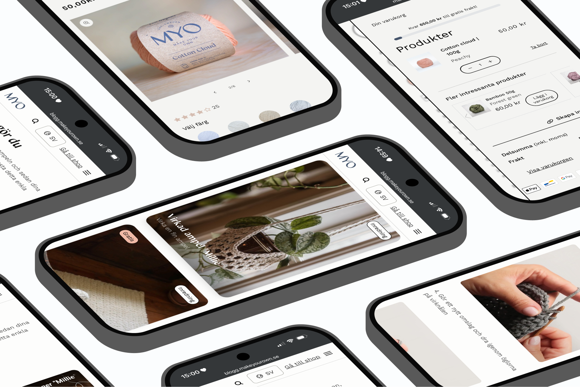
  • Redesigning the e-commerce experience to be clearer, calmer, and easier to scale

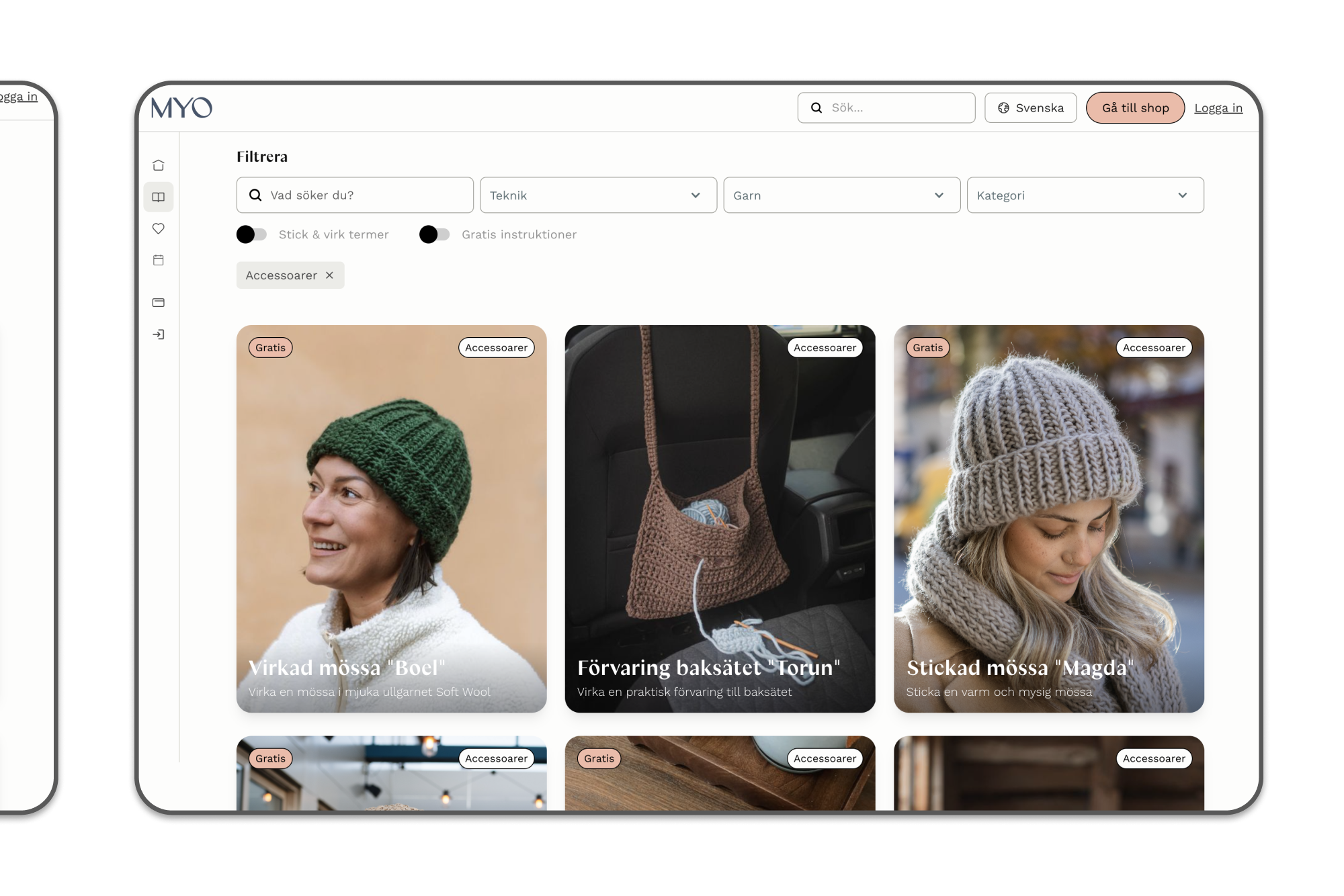
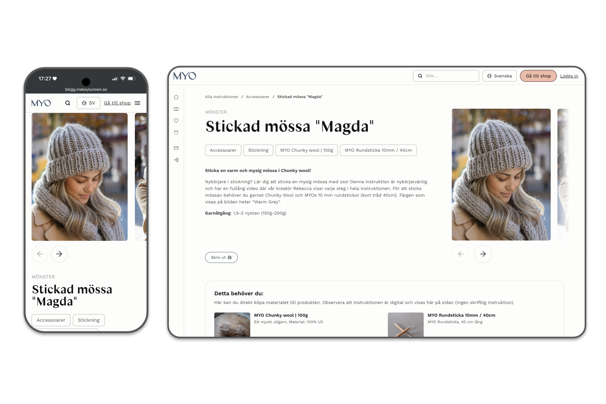
  • Exploring how physical instructions could live digitally, and how they could come together as a community platform (without assuming it needed to look like a social network)

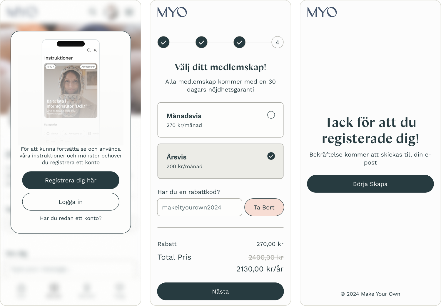
Key decisions included treating content and instructions as modular building blocks rather than static pages, designing the community around participation and progression instead of feeds, and prioritising systems that could evolve over time rather than launching “finished” features.

Collage of mobile screens showing a knitting and crochet app with patterns, payment plans, categories, and instructional videos.
Currently
Platform
Various Features and Functions
05 What shifted

From store to system

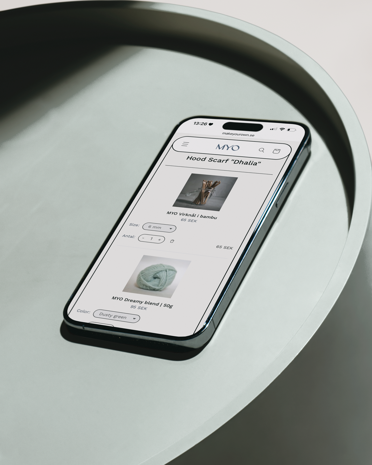
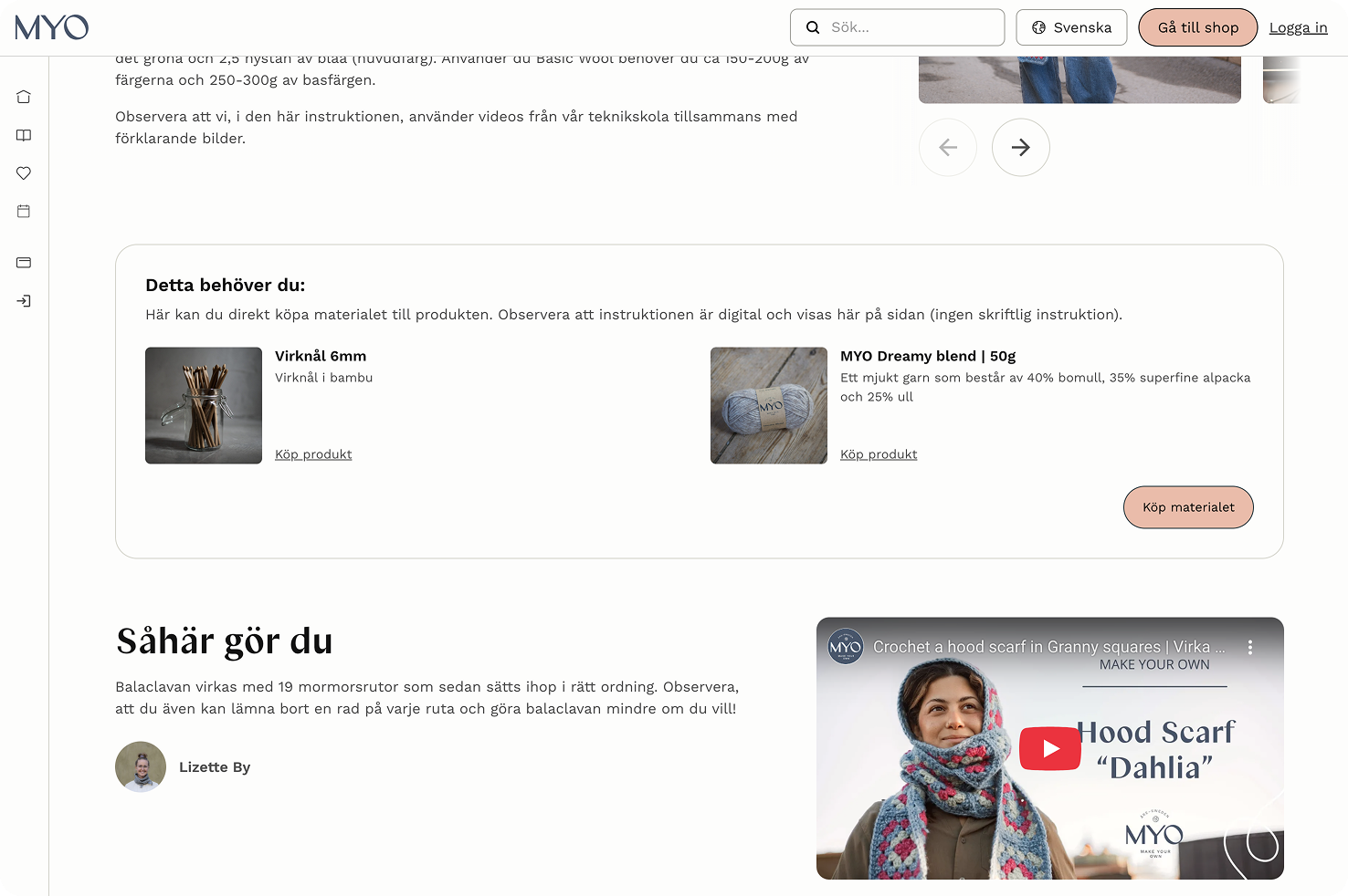
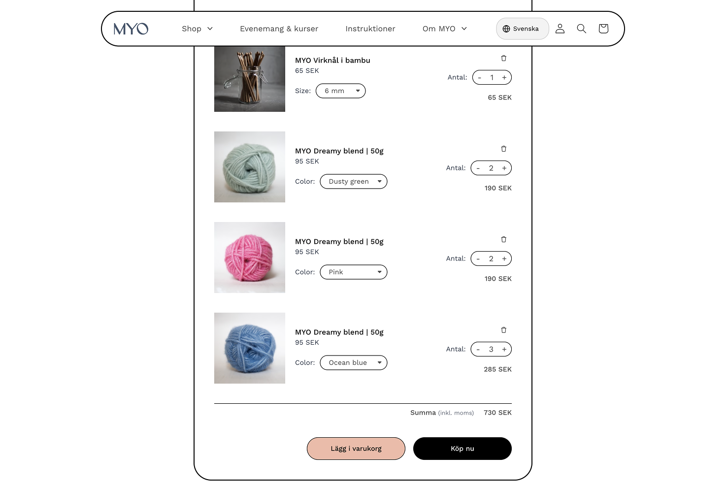
The work didn’t radically change MYO overnight, but it changed how the product could grow. Instructions became structured, reusable digital components, subscriptions were supported without being forced, and the store evolved to better connect learning with materials — making it easier to experiment and grow without redesigning everything again.

Currently

Turned physical instructions into modular digital components.

Currently

Supported subscriptions and repeat use without forcing new behaviours.

Currently

Made it easier to expand the product without redesigning everything.

Multiple smartphone screens showing a yarn craft website with product details, a shopping cart, and crochet tutorials.
Currently
Make Your Own
Instruction to Product User Flow
06 Research

Alignment, not theatre

Research and workshops played a practical role throughout the project. Using usage data, session recordings, heatmaps, and workshops with founders and developers, I identified where people dropped off, how different users related to crafting over time, and how they engaged with the category, while aligning the team around a shared product direction. The goal wasn’t to prove ideas right. It was to reduce uncertainty enough to move forward with confidence.

Platform
Webflow app icon

Webflow

E-commerce
Shopify green shopping bag logo with a white 'S'.

Shopify

Screenshot of a MYO webpage showing materials needed for crochet, including bamboo crochet hooks in a glass jar and a ball of MYO Dreamy blend yarn, plus a tutorial video thumbnail with a woman wearing a blue and pink crochet hood scarf.
Currently
Platform
Instruction Page Quick Cart Integration
Online shopping cart page showing bamboo crochet hooks and three colors of MYO Dreamy blend yarn in dusty green, pink, and ocean blue with quantities and prices in SEK.
Currently
E-commerce
Product Add to Cart User Flow
07 Where it landed

A clearer foundation

Over time, the changes supported measurable growth: increased community engagement, steady social growth, and improved conversion in the e-commerce flow. More importantly, MYO ended up with a digital foundation that matched the founders’ vision and supported steady growth. Part shop, part learning space, part community, not fully defined, but directionally solid.

Online shop page showing free knitting and crochet patterns for accessories including a green crocheted hat, brown car backseat storage bag, and gray knitted hat with scarf.
Currently
Dashboard
User Screen Cards Categories
Online knitting tutorial page for 'Magda' chunky wool hat featuring a woman wearing a gray knitted hat and scarf.
Currently
Instruction
Guide with Products and Step-by-Step Video
Product UI Designer
Portfolio 2022→2025
Available for freelance work
February 2026 →

Let's work together

Often alongside teams and agencies.

Often alongside teams and agencies as a Product UI Designer.

Drop me a message at hey@dankaren.com

Design by: Daniel Kårén
Development by: Sara Gramstad
Back to top ↑
©2026 – All Rights Reserved