aboutworkservices
say hey
Laptop on floor displaying a business analytics dashboard with charts and data, next to a person sitting on a dark chair.

Complex valuations. Smoother workflows.

Making it easier to match tenants

Lorem ipsum dolor sit amet, consectetur adipiscing elit. Suspendisse varius enim in eros elementum tristique.

Client

Full name

Date

March 2023

Role

Role name

Website

www.relume.io

Leonh

Making the existing features easier to work with

Year

2025→

Timeline

1-3 months

Platform

React

Industry

Finance

Tools
figma app icon

Figma

Team

1 Designer, 1 CTO,  3 Engineers

01 Situation

A strong core, growing complexity

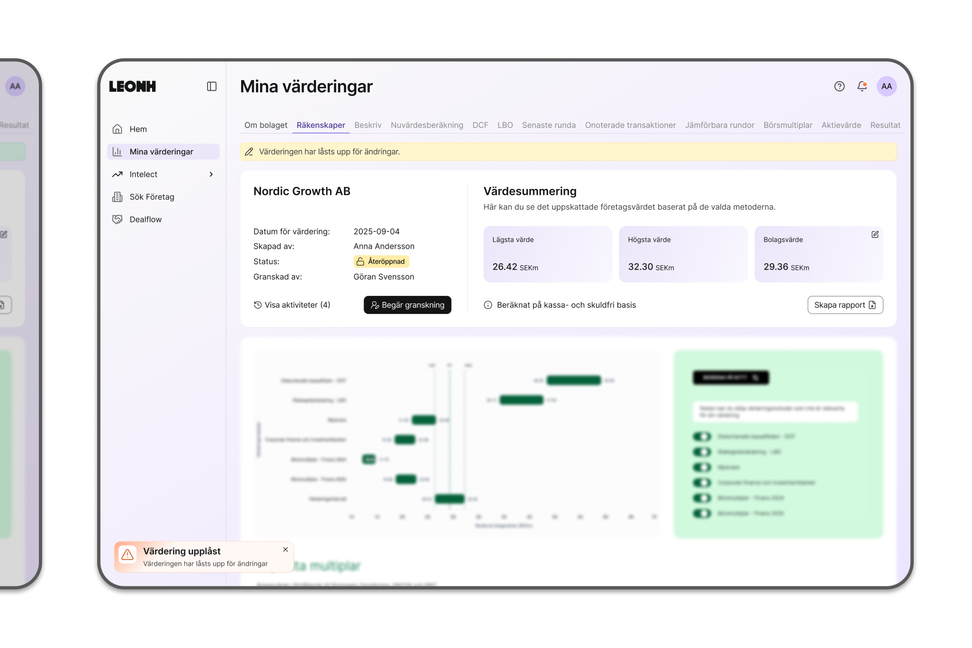
I joined Leonh while their product, Infinity, was already functional and built on deep domain expertise. The core logic was solid, but the interface and workflows hadn’t yet caught up with the complexity the product needed to support. The work wasn’t about adding features, it was about making what already existed easier to work with as the product continued to grow.

Open laptop on a white abstract-shaped table displaying a financial dashboard in Swedish with activity log popup.
Currently
Dashboard
Valuation → Activity Log
Open laptop on a round white table displaying a Swedish financial planning dashboard with metrics like budget, EBITDA, and EBIT.
Currently
Dashboard
Valuation Table
02 What I stepped into

Capable software, evolving structure

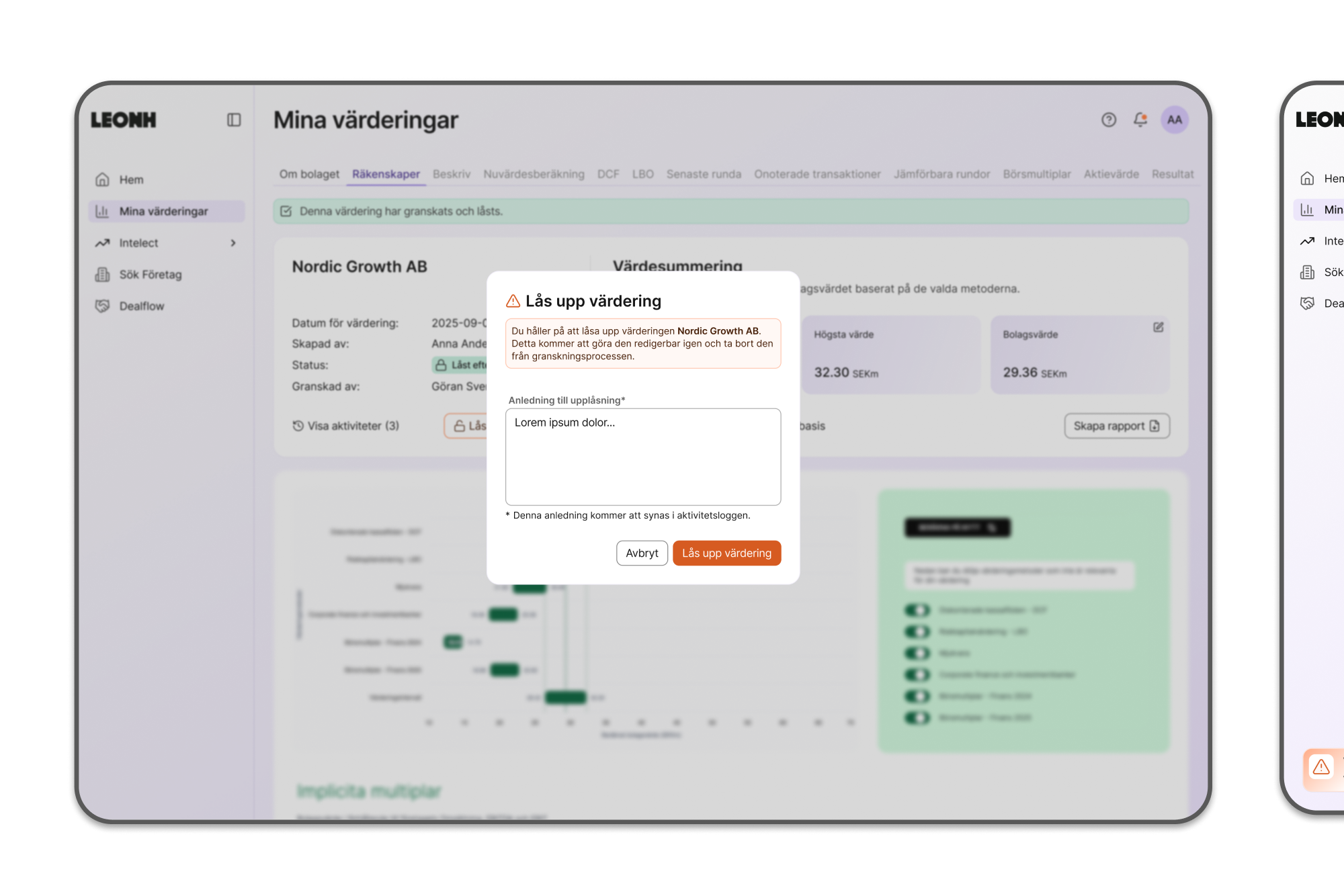
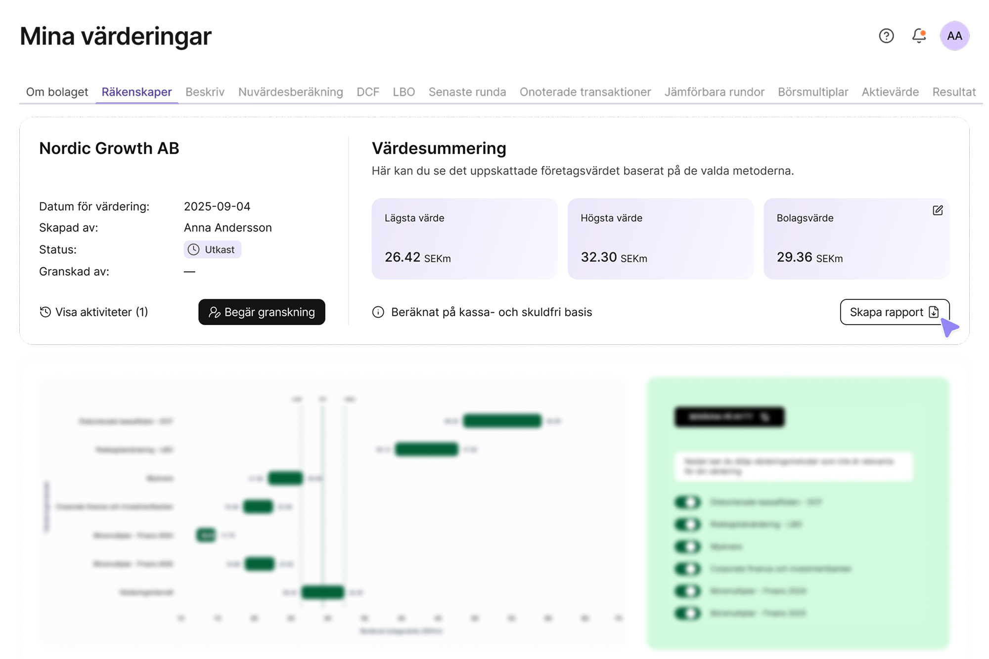
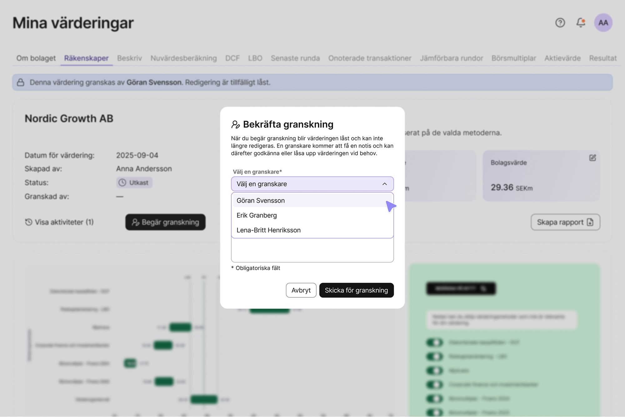
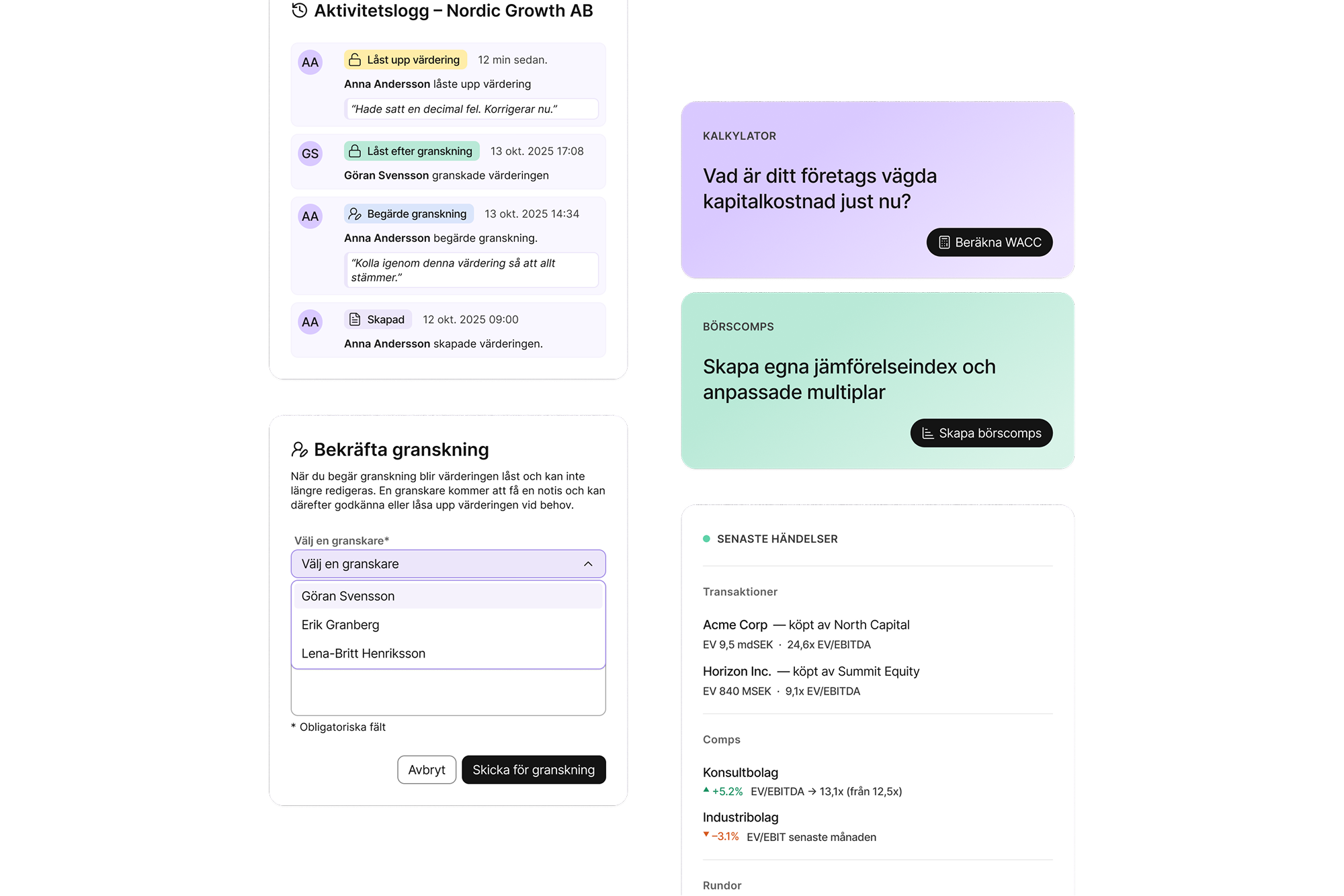
From a development perspective, Infinity could already do a lot. From a product and design perspective, some structural aspects needed to evolve. The dashboard was organised in parts, workflows varied between sections, and UI decisions were often made locally, screen by screen. This made it harder to reason about the product as a whole, and harder for engineering to build with long-term confidence. Nothing was fundamentally broken, but there was an opportunity to anchor things more clearly.

03 Tensions

Speed and clarity at the same time

The main tension wasn’t visual or feature-driven. It was about pace. As a startup, Leonh needed to move quickly and stay lean. At the same time, continuing without shared structure risked creating patterns that wouldn’t scale, or that would need to be revisited later. The questions shaping the work became:

Currently
Pace

How do we introduce clarity without slowing things down?

Currently
Flexibility

What should exist as a rule of thumb, and what should remain flexible?

Currently
Restraint

How do we work thoroughly without overbuilding?

Financial valuation summary for Leonh AB showing estimated company values: lowest 26.42 SEKm, highest 32.30 SEKm, and company value 29.36 SEKm, created by Anna Andersson with status draft.
Currently
Dashboard
Create New Report
Popup window titled 'Bekräfta granskning' showing a dropdown menu to select a reviewer with options Göran Svensson, Erik Granberg, and Lena-Britt Henriksson, and buttons to cancel or submit the review request.
Currently
Dashboard
Submit for Review
04 Decisions I owned

Structure before polish

My focus was on helping define a foundation the team could realistically build on. This meant establishing a clearer dashboard structure, aligning key workflows across the product, and defining component rules and interaction logic in close collaboration with engineering. I deliberately deprioritised visual refinement. At this stage, clarity mattered more than polish. I also chose not to redesign everything, keeping parts of the existing interface intact helped preserve logic that was already working and allowed the team to maintain momentum.

Dashboard showing activity log with valuation review actions, a confirmation form to select a reviewer, calculators for WACC and customized stock multiples, and latest transaction and company comparison data.
Currently
Dashboard
UI Components
05 What shifted

From local decisions to shared reference

Once structure and rules were in place, the nature of the work changed. Design conversations gradually moved from “How should this work?” to “What should we build next?” The team gained a shared frame of reference for layouts, components, and workflows, reducing the need to revisit foundational decisions.

Currently

Established a shared structure for layouts and workflows.

Currently

Shifted design conversations from local fixes to product direction.

Currently

Reduced repeated decisions by clarifying component logic.

Dashboard interface showing financial data and company valuations with charts and activity logs in Swedish.
Currently
Leonh Infinity
Various Screens Valuation User Flow
06 Research

Working closely with engineering

A large part of the work happened in close dialogue with engineering. Component logic and layout decisions were shaped around what could realistically be built, what needed to stay flexible over time, and where consistency mattered more than configuration. The goal wasn’t to define a perfect system, but a usable one the team could extend without rethinking the basics each time.

Design
figma app icon

Figma

System
Blue React logo consisting of an atom symbol with three elliptical orbits around a central dot on a white rounded square background.

React

Financial planning dashboard in Swedish showing historical, budget, and forecast values for revenue, EBITDA, EBIT, and CAPEX from 2021 to 2028 with editable fields and navigation menu on the left.
Currently
Dashboard
Annual Business Plan Table
Dashboard showing EV/Revenue multiples per industry sector with a bar chart, market reports thumbnails, weighted average cost of capital calculator, and recent transactions list in Swedish.
Currently
Dashboard
Intel Transaction EV Turnover
07 Where it landed

Clearer, not finished

By the end of my involvement, Infinity had a clearer foundation: defined core workflows, a more coherent dashboard structure, and component logic that supported continued development. The product wasn’t, and didn’t look, finished. But it was no longer ambiguous at a structural level, making future work easier to reason about and build on.

Dashboard interface of Leonh AB showing company valuation details dated 2025-09-04 with a status of 'Reopened', a valuation summary indicating lowest, highest, and company values in SEK million, and options to request review or create report.
Currently
Dashboard
Valuation Report Changes
Dashboard screen displaying a locked valuation summary for Leonh AB with a popup warning explaining unlocking the valuation will make it editable and remove it from the review process.
Currently
Dashboard
Valuation Report Unlock Pop Up
Product UI Designer
Portfolio 2022→2025
Available for freelance work
February 2026 →

Let's work together

Often alongside teams and agencies.

Often alongside teams and agencies as a Product UI Designer.

Drop me a message at hey@dankaren.com

Design by: Daniel Kårén
Development by: Sara Gramstad
Back to top ↑
©2026 – All Rights Reserved