aboutworkservices
say hey
Laptop on wooden table displaying Coly website with heading 'Scientific profiling and matching' and a blue request demo button.

Making it easier to match tenants.

Making it easier to match tenants

Lorem ipsum dolor sit amet, consectetur adipiscing elit. Suspendisse varius enim in eros elementum tristique.

Client

Full name

Date

March 2023

Role

Role name

Website

www.relume.io

Coly

Focusing the product around what mattered most

Year

2022→

Timeline

12 months

Platform

React, Webflow

Industry

Shared Living

Tools
figma app icon

Figma

Webflow app icon

Webflow

Team

2 Designers, 1 PM, 1 CEO, 2 Engineers

01 Situation

Joining mid-flight

I joined Coly at a point where the product no longer fully reflected where the company wanted to go. The idea was strong. The matching method had been tested. The product covered a lot of ground. But there was an open question around focus, and what the product really needed to be good at.

Person holding a smartphone displaying a personality test with gender options and a hand carrying two takeaway coffee cups labeled 'coly'.
Currently
Personality Test
Multiple Choices A-E
Smartphone displaying a personality test app screen with a question about energy level, placed on glossy dark blue tiles.
Currently
Personality Test
1-5 Rating
02 What I stepped into

A lot of momentum, a lot of overlap

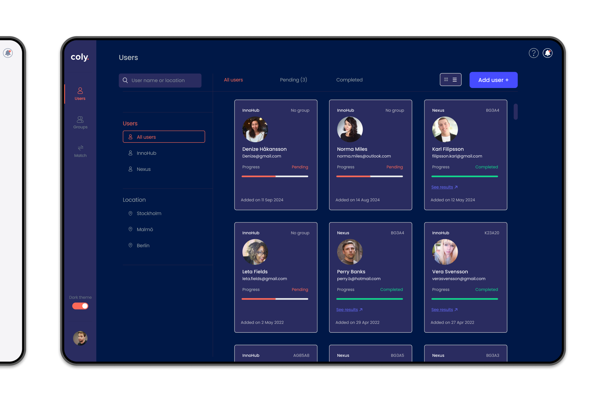
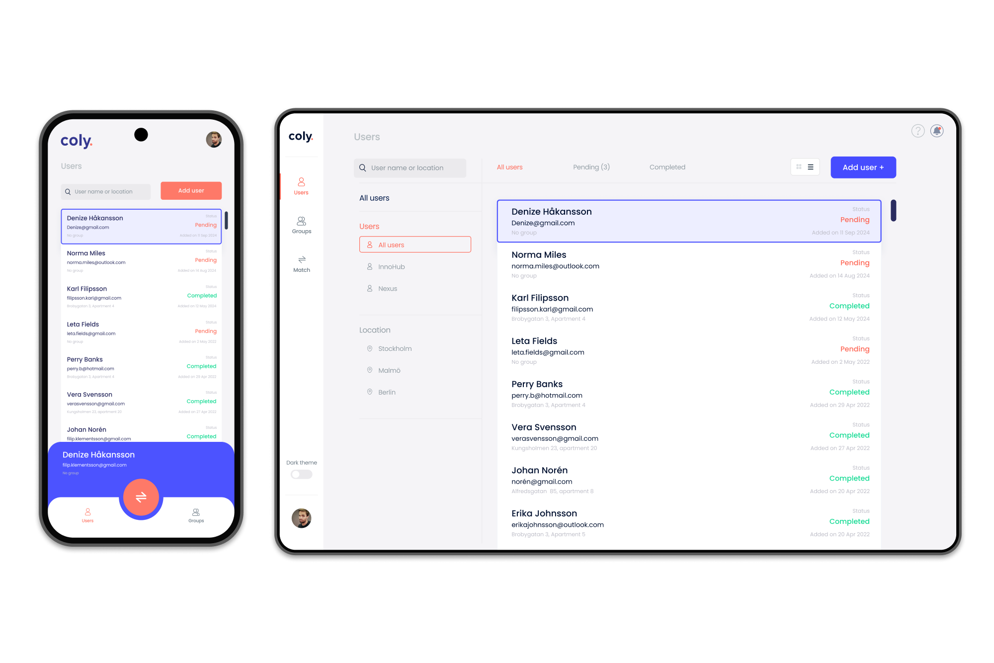
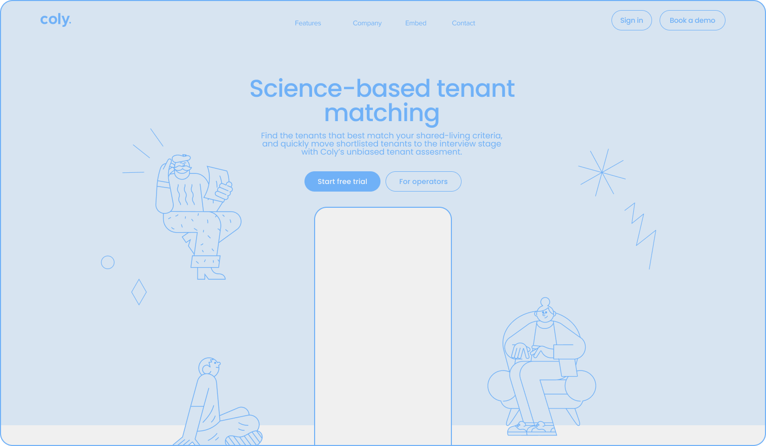
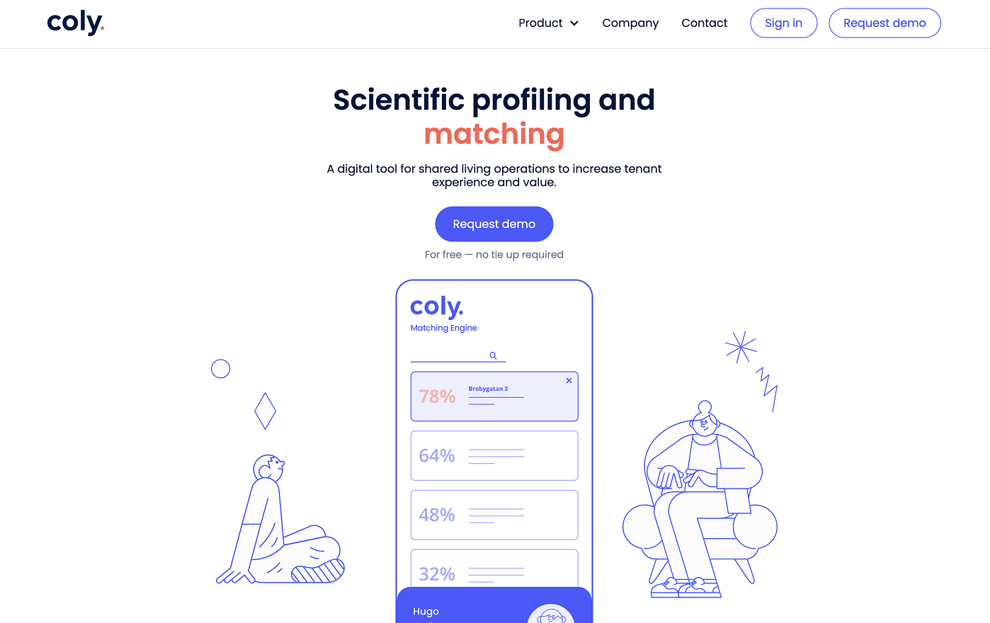
When I came in, Coly had plenty going for it, but was also in the middle of change. The product was trying to serve multiple audiences at once, with overlapping features and core flows competing for attention. Everything technically worked, but the overall experience felt diluted. It was hard to tell what mattered most: for users, or for the business.

03 Tensions

Strategic, not visual

The main tension wasn’t visual. It was strategic. These weren’t decisions design could make in isolation. They required collaboration, discussion, and a lot of restraint.

Currently
Focus

Should Coly be a broad co-living platform, or a focused roommate matcher?

Currently
Features

How much functionality was actually needed for the right product–market fit?

Currently
80/20

What could be simplified without undermining the science behind the matching?

Three mobile screens showing a personality test app titled Coly ME, with questions about date of birth, country of residence, and gender selection with options including Female, Male, Non Binary, Other, and Prefer not to say.
Currently
Personality Test
Questions 1-3
Personality test interface showing question 4 out of 84 with a statement about high energy and activity, with answer scale from 1 to 5 and choice 4 selected.
Currently
Personality Test
1-5 Rating Details
04 Decisions I owned

Reducing uncertainty

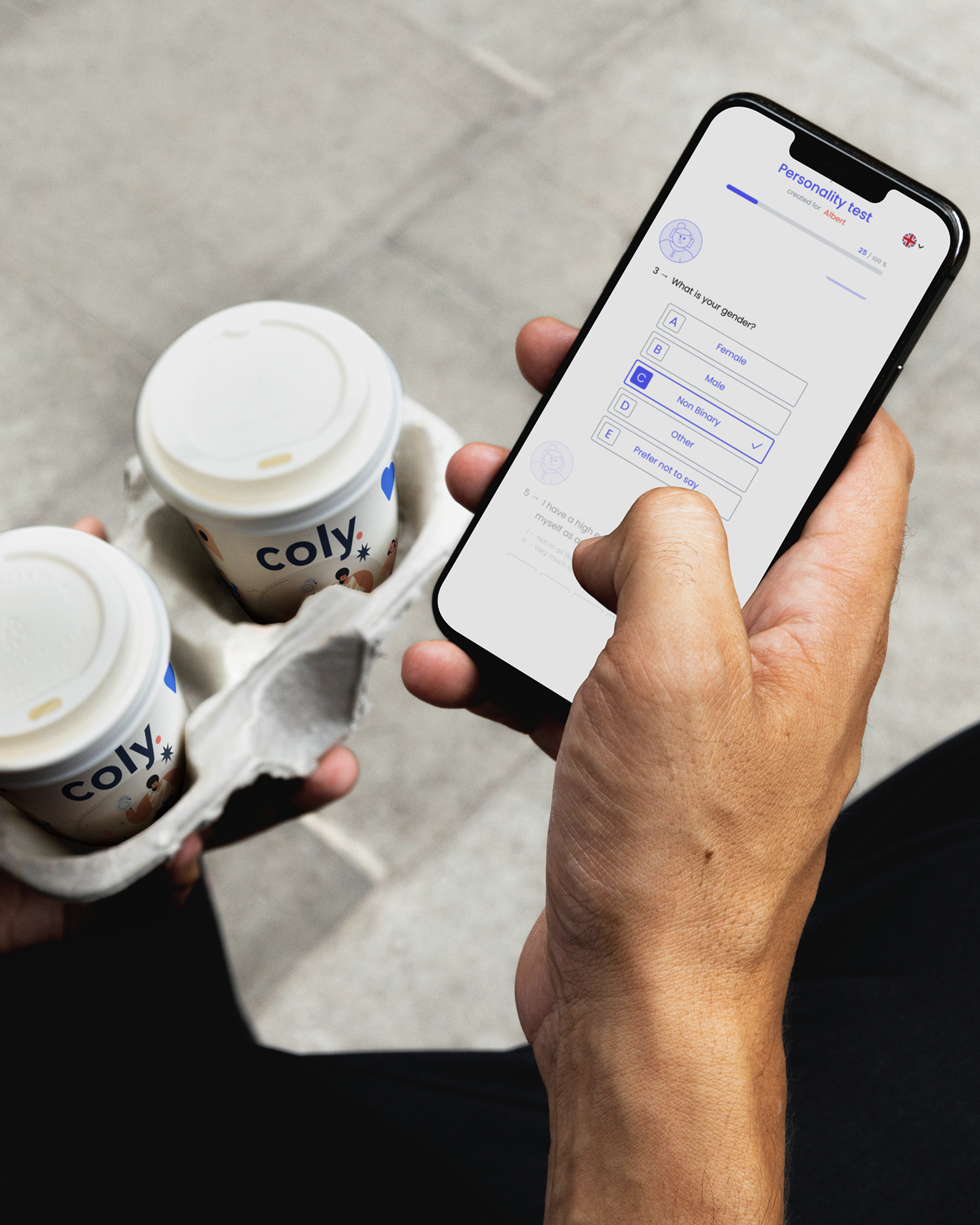
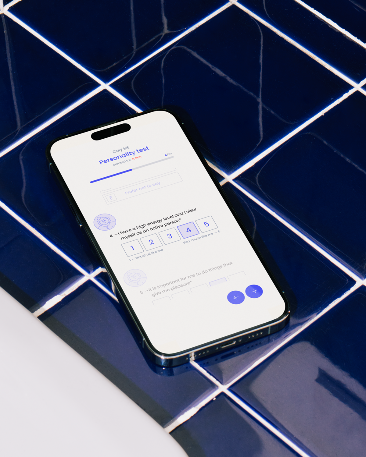
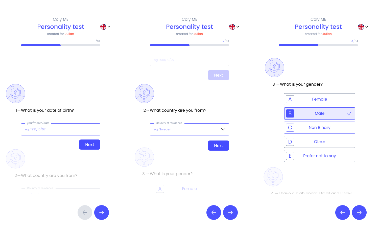
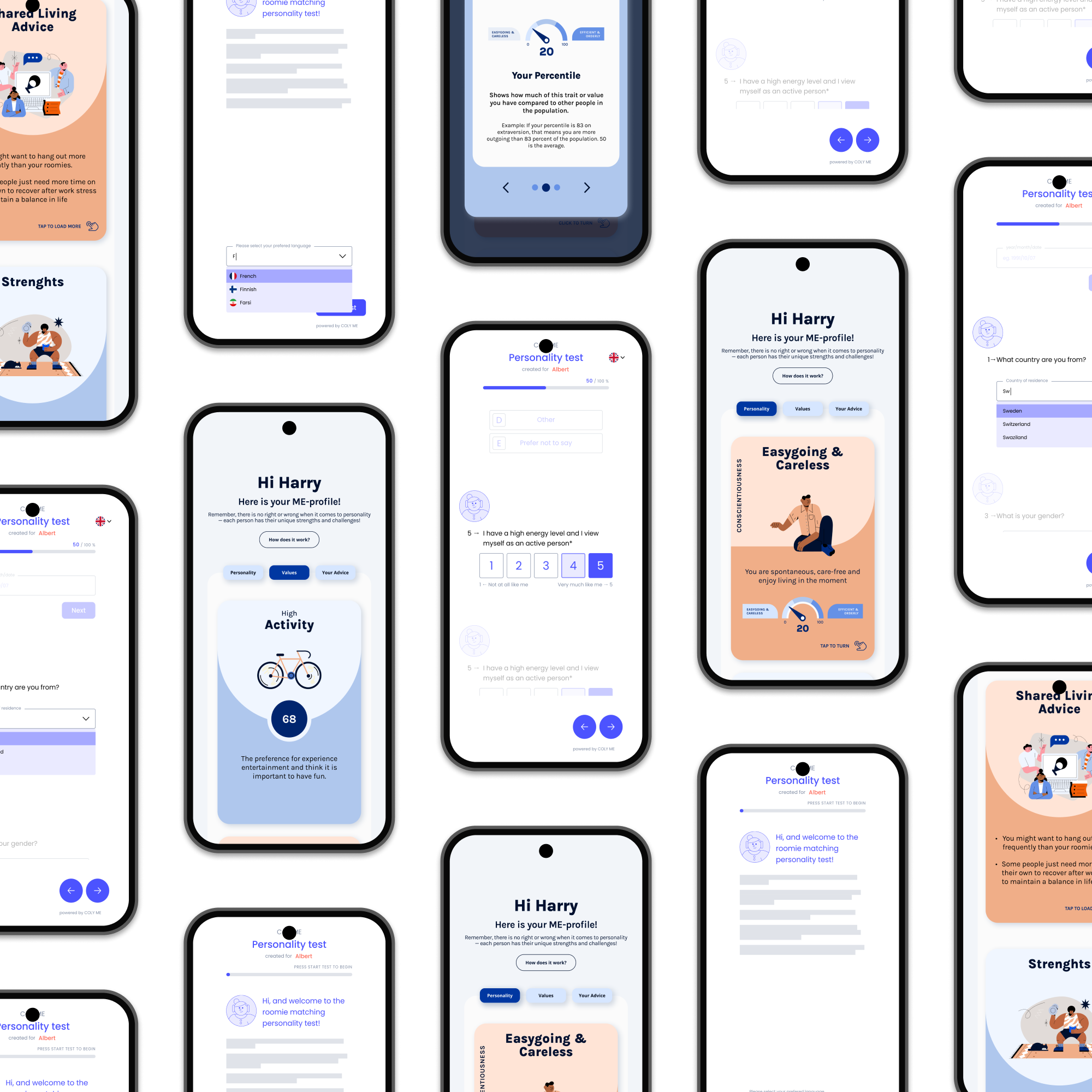
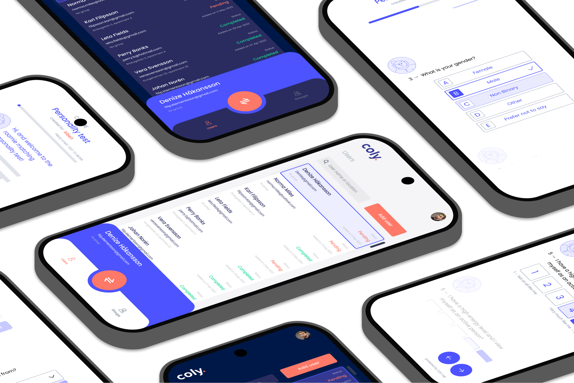
My role was to help reduce uncertainty and bring clarity to what to build, and what not to. I worked closely with Coly’s CPO and development team to align on product direction, scope, and priorities. This included narrowing the dashboard to emphasise matching over management, shaping the personality profile to feel approachable without losing credibility, and reworking the psychometric test to feel lighter and more personal without becoming shallow.

Multiple smartphone screens showing a personality test app with results, including profiles labeled 'Hi Harry,' activity levels, personality traits like 'Easygoing & Careless,' and shared living advice.
Currently
Personality Test
Test Updated UI and Results Following Old UI
05 What shifted

Focus over expansion

The outcome wasn’t a radically new product, but a calmer and more focused one. We reduced competing paths, clarified primary actions, and landed on a product that was easier to use and easier to explain, both internally and externally. This made it clearer who the product was for, and why it existed.

Currently

Clarified what matters by removing parallel flows and secondary actions.

Currently

Made the core actions obvious and easier to act on, without explanation overhead.

Currently

Improved usability and shared understanding, internally and externally.

Multiple angled smartphone screens showing a personality test app named Coly with user lists, gender selection, and question rating interfaces.
Currently
Matching Engine
Dark Mode and Light Mode for Operator Dashboard
06 Brand and website

Keeping things aligned

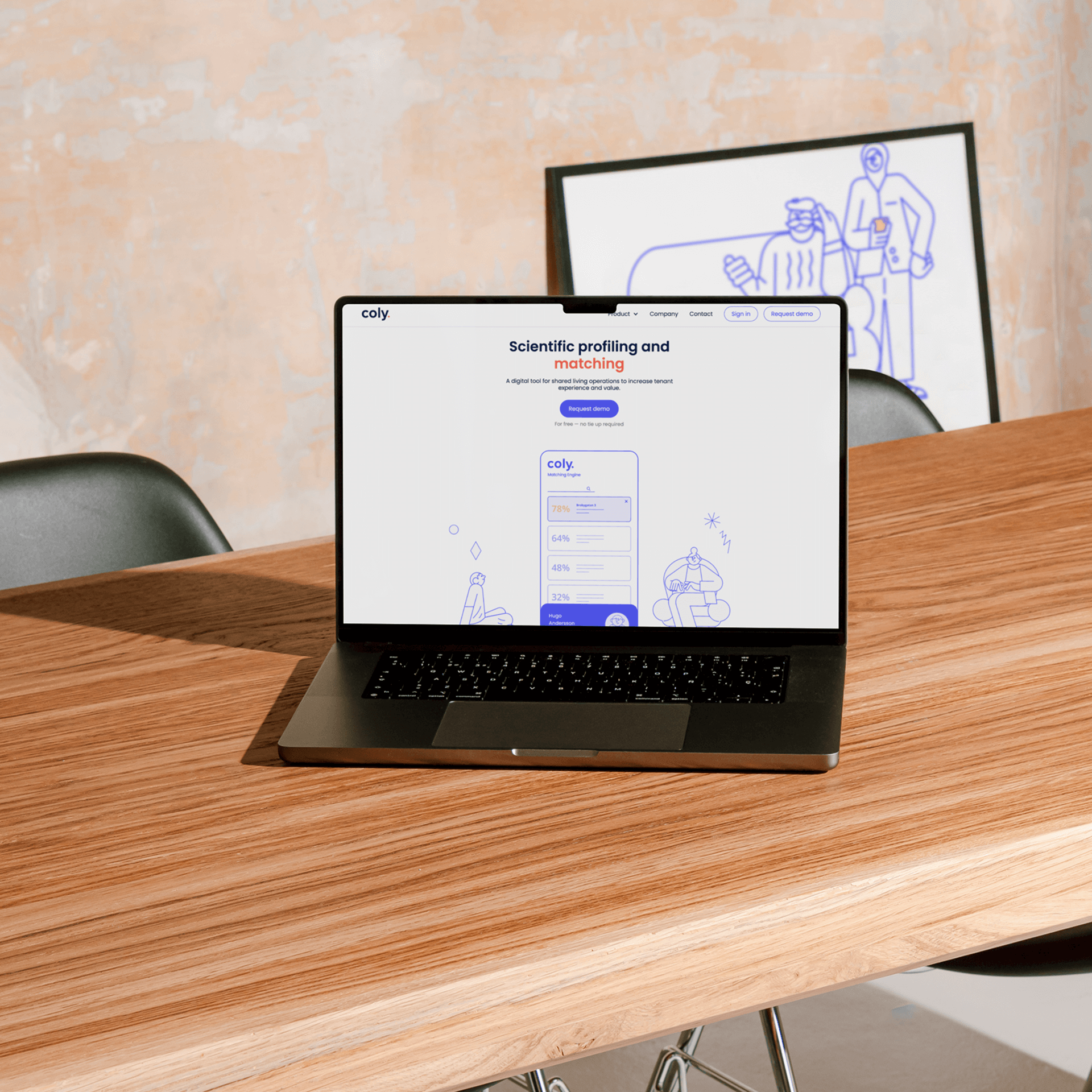
As the product direction became clearer, the brand and website needed to follow. I worked on extending Coly’s website using Figma and Webflow, focusing less on polish and more on alignment. The goal was simple: make sure what we communicated externally matched what the product actually delivered. This supported Coly’s positioning in the US college market, where clarity and trust mattered more than feature depth.

Prototyping
figma app icon

Figma

Marketing
Webflow app icon

Webflow

Website homepage for Coly showing science-based tenant matching with illustrated people and call-to-action buttons for starting a free trial or for operators.
Currently
Landing Page
Wireframe for Hero
Coly digital tool homepage showing scientific profiling and matching for shared living operations with illustrations of two people and a matching engine interface.
Currently
Landing Page
Live Site Hero
07 Where it landed

Steady progress

Not everything we worked on was elegant or pixel-perfect, and not every decision was design-led. But the product shipped in a more focused state than when I arrived: clearer to use, clearer to explain, and easier to build on. That’s usually the kind of progress that lasts.

User management dashboard displaying users with profile pictures, names, emails, progress status as Pending or Completed, and date added, with navigation menu on the left and an Add user button.
Currently
Dashboard
User Screen Cards Layout Dark Mode
User management interface showing a list of users with their email addresses, status labeled as Pending or Completed, and options to add users, filter by groups and location on both mobile and desktop screens.
Currently
Dashboard
User Screen List Layout Light Mode
Product UI Designer
Portfolio 2022→2025
Available for freelance work
February 2026 →

Let's work together

Often alongside teams and agencies.

Often alongside teams and agencies as a Product UI Designer.

Drop me a message at hey@dankaren.com

Design by: Daniel Kårén
Development by: Sara Gramstad
Back to top ↑
©2026 – All Rights Reserved